← Back to UX News Feed
Is hot coral a feature or a liability? A closer look at the colour of your bank card.
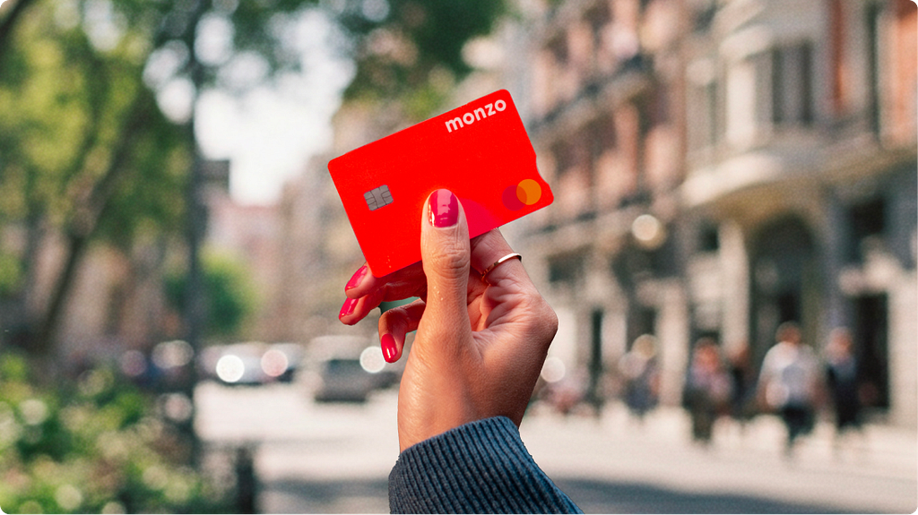
 Most bank cards used to look like they had been designed for people who didn’t want to be seen using them. Navy, charcoal, the occasional restrained burgundy. Then Monzo turned up with one the colour of a traffic cone, and many challengers have been chasing distinctiveness ever since.There is a sensible argument that an attention-grabbing, colourful debit card is a security risk. If it falls …
Full Product UX article at UX Collective »
Fair use excerpts with source attribution for comment, news reporting and instructive commentary only. Original summary description and analysis by UXdesign.com’s authors. Original content © UX Collective.